

Wayfinding Strategy
The central objective of our project was to elevate the customer experience at Best Buy by addressing challenges in navigation and orientation. To achieve this, we designed a robust wayfinding strategy tailored specifically for Best Buy’s parking lot. This strategy aims to simplify navigation, minimize the time customers spend locating parking spots, and enhance overall accessibility. By streamlining these critical touchpoints, we hope to foster a more seamless and enjoyable shopping journey for every visitor.
Research Insights
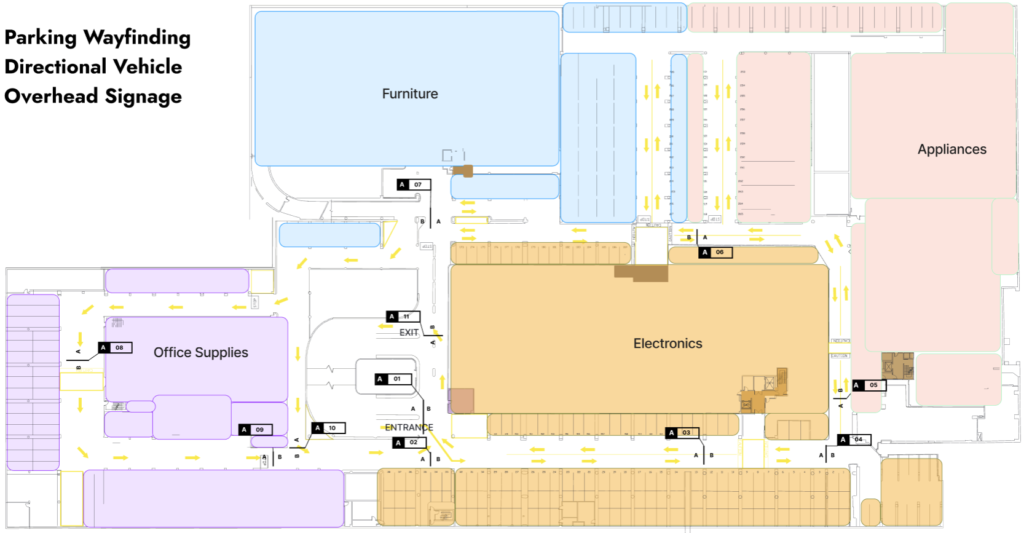
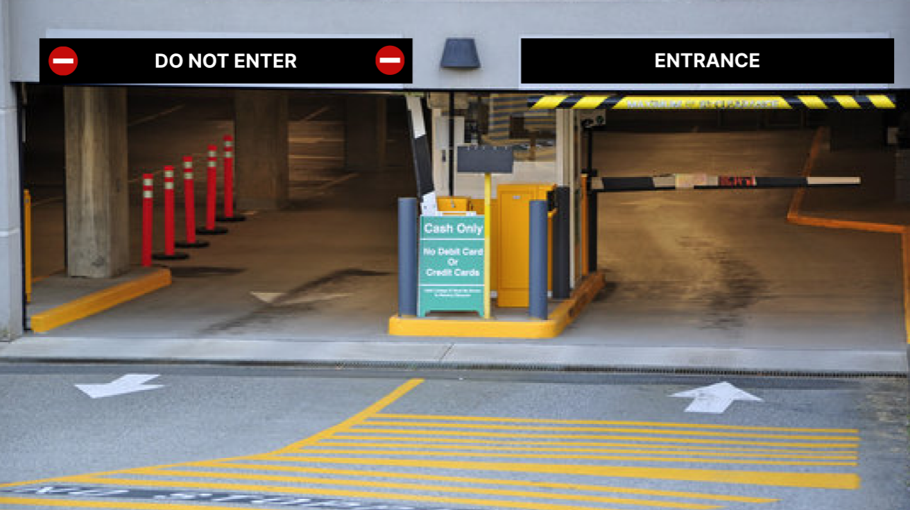
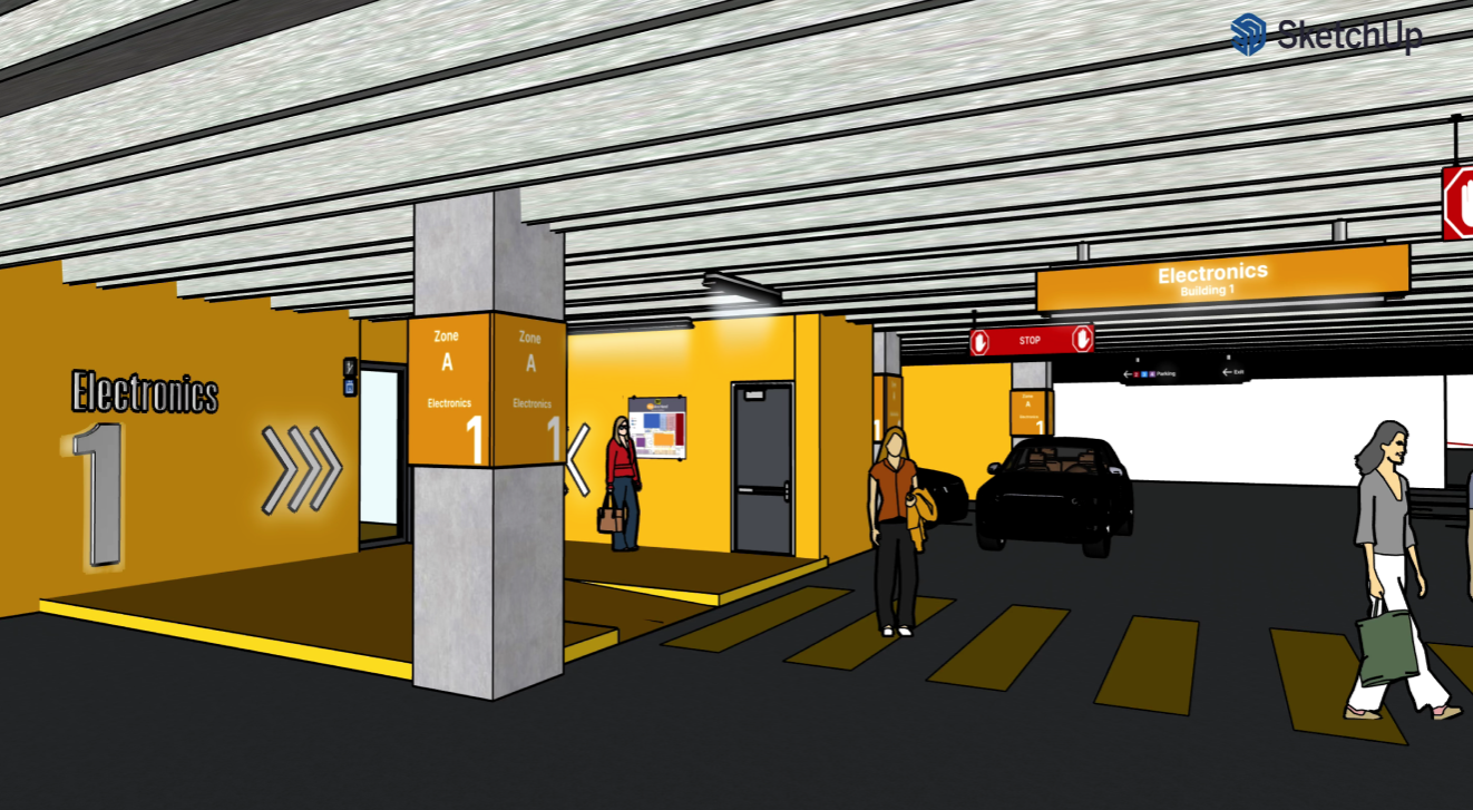
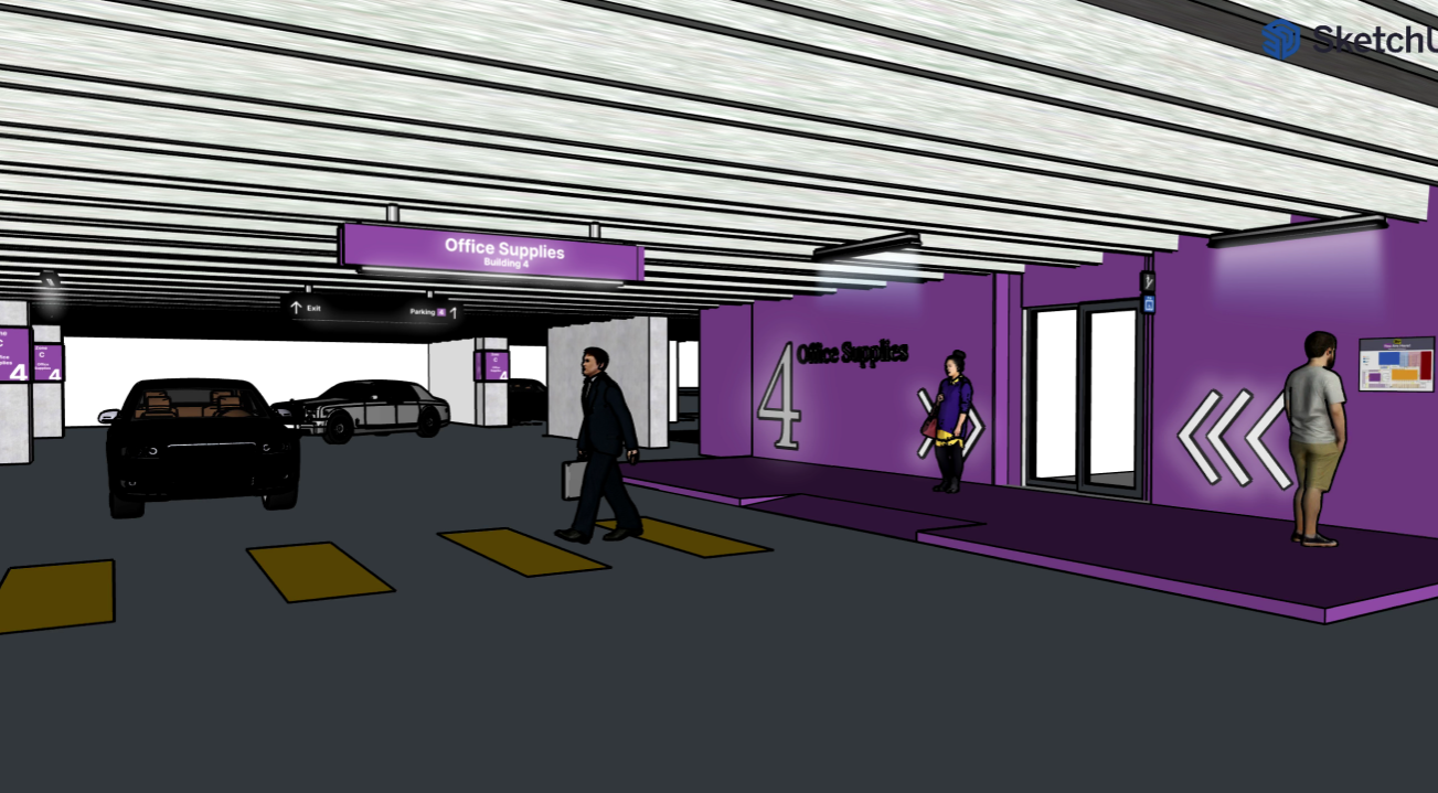
We started by analyzing the existing layout of the Best Buy parking lots, and understanding common navigation challenges faced by customers. This included traffic flow, visibility of signage, and user behavior patterns. It was such a large area to cover we decided to divide each department into a color coded system, so that customers could easily identify the buildings. This improved traffic flow of customers so they could easily find the departments they needed. One of the other areas of research we conducted was on directional signage. The parking signage included thematic naming, which will help customers identify where they can park. Also, customers how they can maneuver safely and freely through the parking lot.
Floor Plan
We created detailed floor plans that optimized the traffic flow and parking layout. This involved repositioning parking spots, designing pedestrian zones, and specifying locations for overhead signage and directional markers. To ensure accessibility for all users, we prioritized clearly marked paths and designated parking areas for individuals with disabilities. Additionally, we incorporated visually intuitive elements and consistent signage to minimize confusion and create a seamless navigation experience.
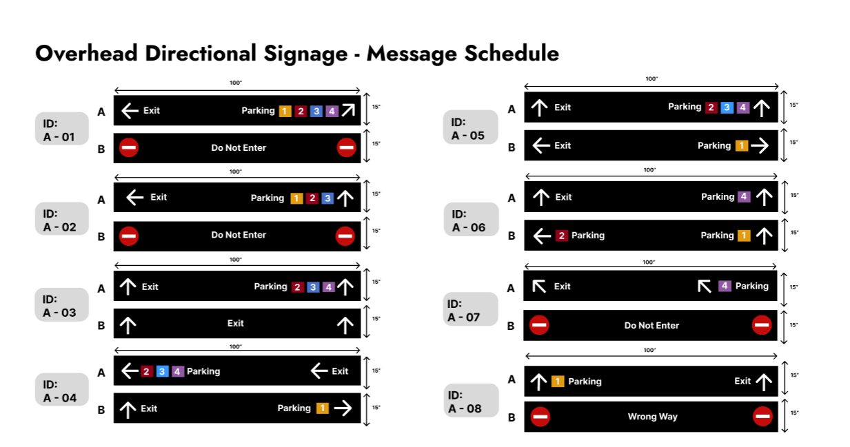
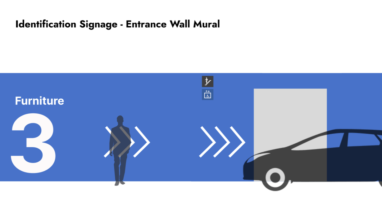
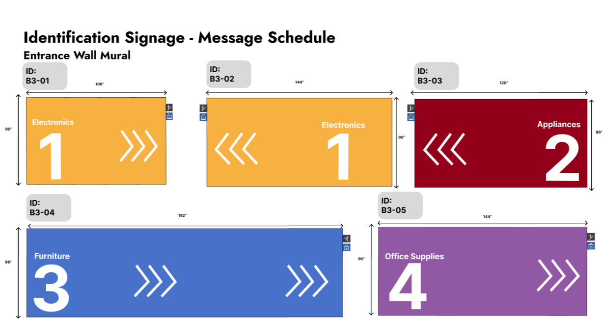
Graphic Designs
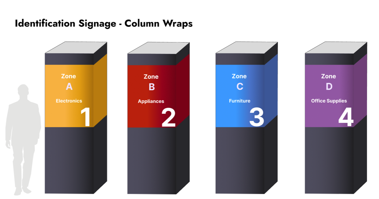
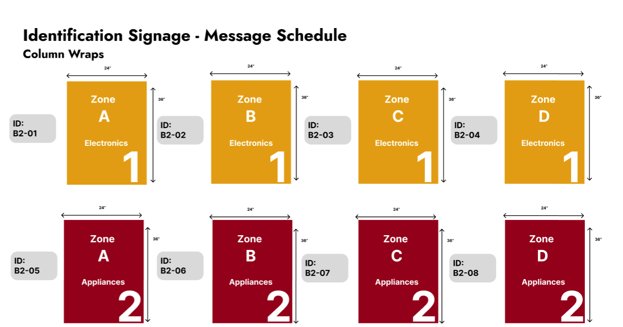
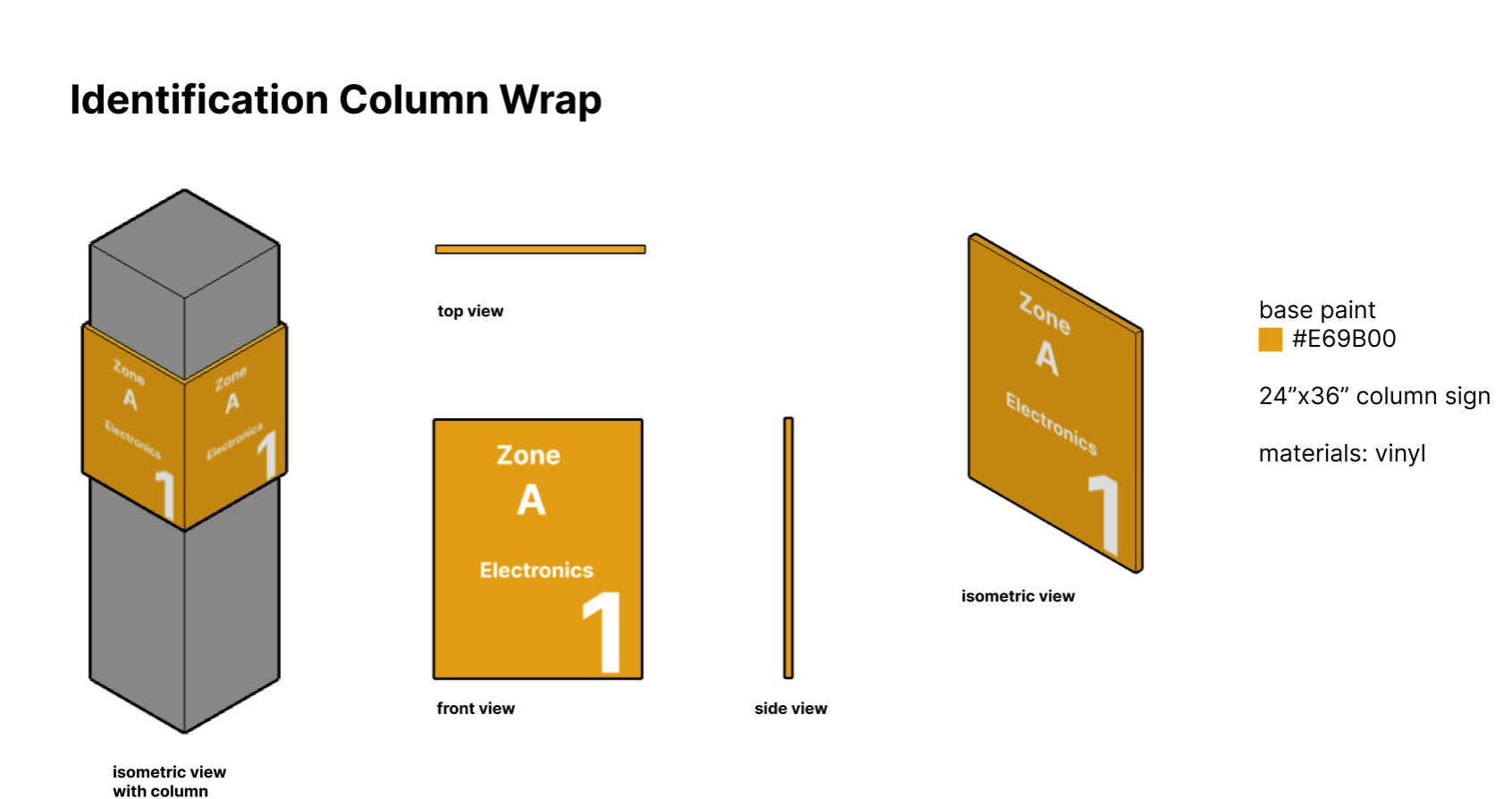
We designed and created a variety of graphic designs that were later transformed into system hardware using Figma and Adobe Illustrator. For example, we developed column wraps for each parking level to provide clear visual cues and create a consistent theme. Identification signage was crafted to help users quickly locate their parking level, while overhead directional signage ensured smooth navigation throughout the parking structure. Additionally, entrance wall murals were designed to enhance the aesthetic appeal of the space and create a welcoming atmosphere for visitors.
To ensure functionality and effectiveness, we focused on using bold colors, legible typography, and universally recognizable symbols. The designs were tested for scalability and durability, ensuring they could withstand environmental factors like weather and wear. By integrating these elements, we aimed to create a cohesive visual system that not only guided users efficiently but also elevated the overall customer experience.
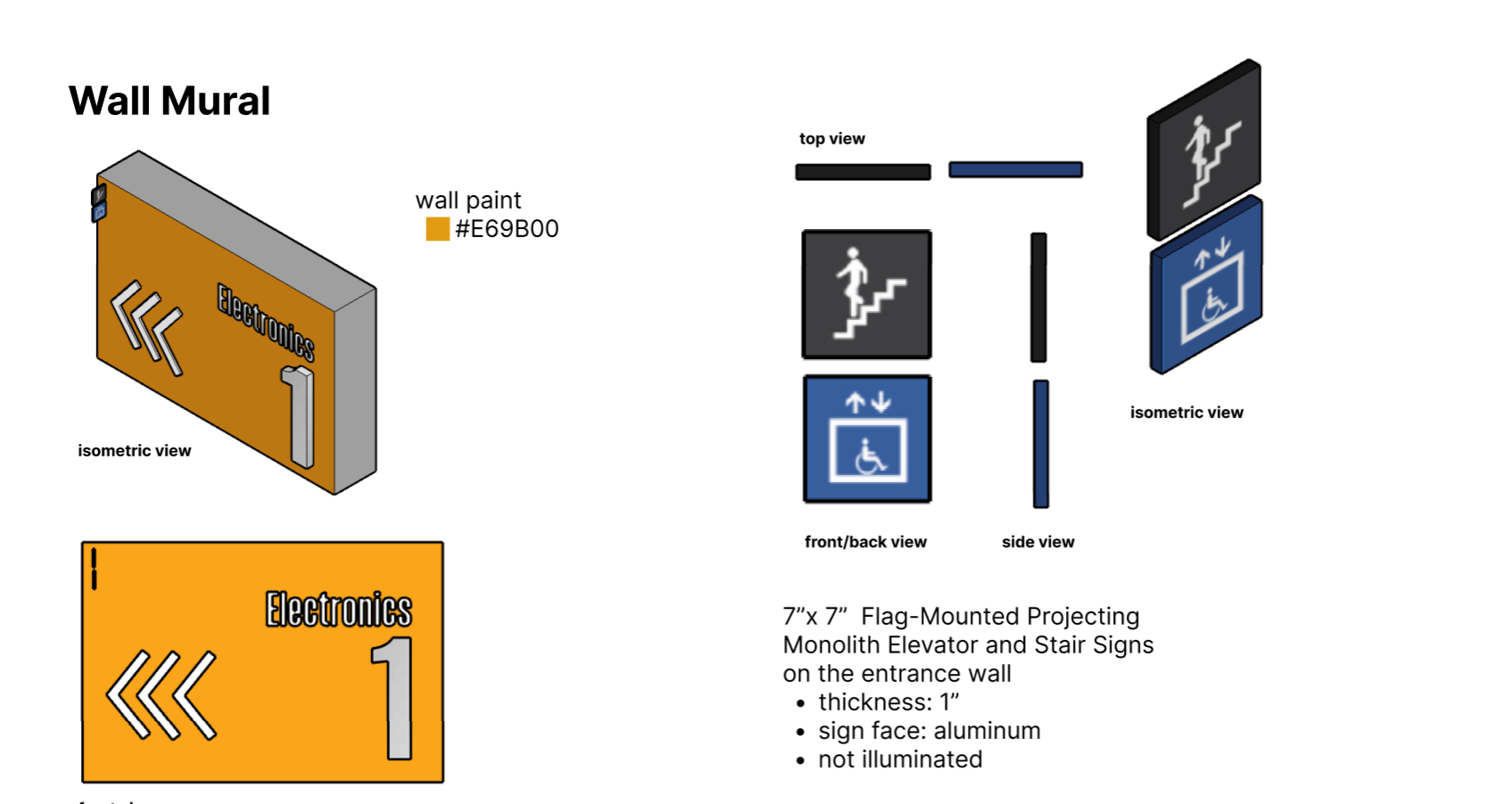
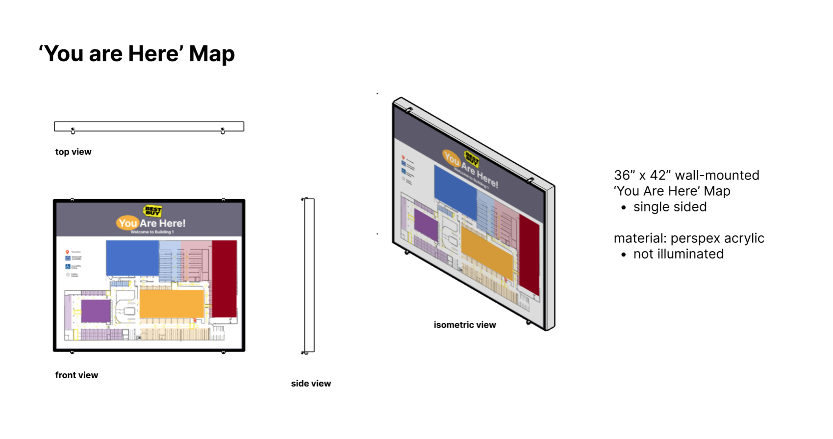
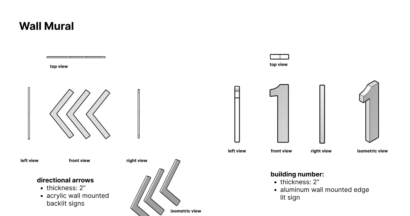
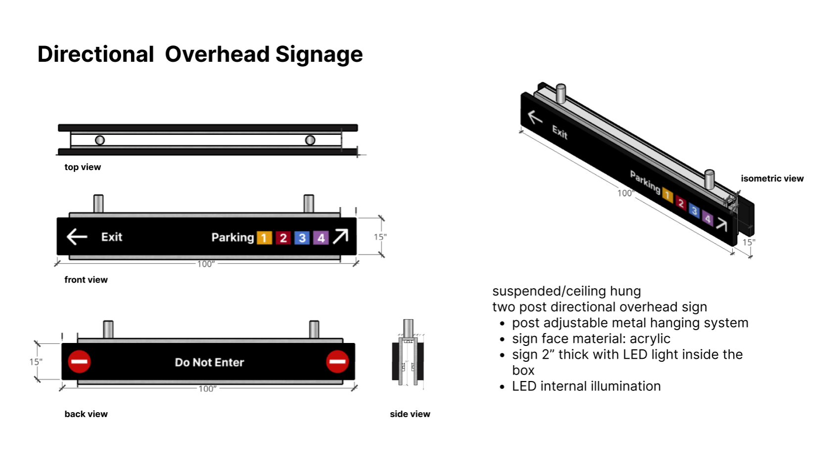
System Hardwares
Here is a series of innovative designs for some of the system hardware we plan to integrate into the parking lot. After creating the graphic designs, we developed 3D models to analyze dimensions and ensure each design would function effectively in real-world conditions. This process allowed us to assess how lighting could be incorporated into the designs, ensuring they remain highly visible to customers throughout all times of the day, including low-light environments. Additionally, the 3D models helped us evaluate the materials and positioning needed to optimize durability and usability. By combining aesthetics and functionality, these designs are tailored to enhance the overall user experience and establish a cohesive visual identity within the space.
Mockups
To finalize the project, we created realistic mockups using SketchUp, incorporating 3D designs and lighting to simulate the finished product. These mockups provided valuable insights into dimensions, aesthetics, and functionality in real-world conditions.
© 2025 All Rights Reserved.